Table of contents
Getting Started with Insights
Thursday February 15, 2024-29 min readIntroduction
Insights bring your organization’s data to life. You can create customized views for any topic, keeping track of the information that matters most. This guide covers everything you need to know about Insights, from creating them to sharing with your team, and how they can help you extract valuable information from your apps.
Important note: Insights are fairly reliant on SQL (Structured Query Language) for displaying data. SQL is a widely adopted coding language that is used to communicate with your Appward database. This guide will provide examples of some basic commands (also known as queries) that you can use to retrieve data, but we recommend you learn some basic SQL code to generate custom analytics. Some great resources can be found at https://www.w3schools.com/sql/ and https://www.khanacademy.org/computing/computer-programming/sql.
Let’s get started
To open the Insights app, go to the Productivity tab of the main navigation menu and select Insights.
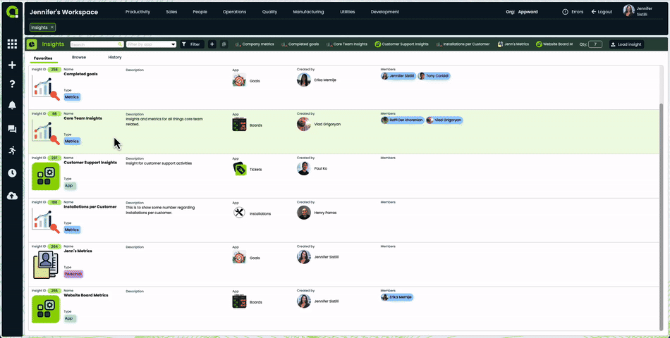
When you open the app, you’ll see a screen similar to this.
Each item in the list is a separate Insight record. They are comprised of a name, description, a plethora of analytical data and more. We’ll cover exactly what each Insight consists of in the next section.
Note: If it’s your first time opening the app, this screen will be empty.
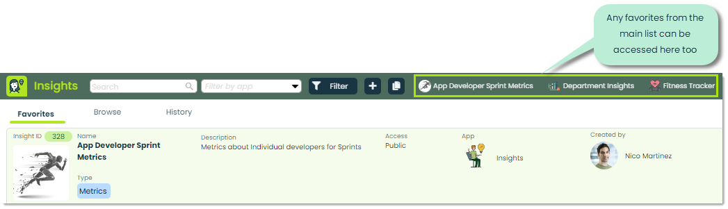
You’ll see that there are three tabs at the top of the app.
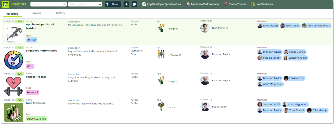
The Favorites tab is where you’ll find a list of all the Insights you’ve marked as your favorites. Here, you can quickly access any Insights that are important to you. In addition to the list, you can access your favorites in the header of the app as pictured below. This is so that if you’re looking at one Insight, you can quickly switch to another.
The Browse tab contains a list of Insights from your entire organization.
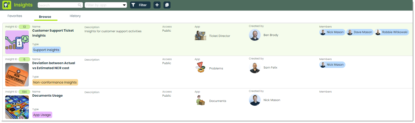
Any Insights that are publicly available or that you are a member of will appear in this list.
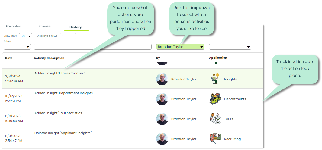
The History tab gives you full traceability of any changes made to Insight records from any app. You can see who made changes, to what Insights and who made them. You can use the filters at the top of this tab to narrow your results to specific time frames, activities, people or applications.
How to create an Insight (in Insights app)
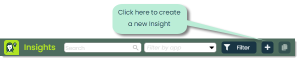
To create an Insight, click the + button at the top of the app.
You’ll see a popup similar to the one below for you to fill out the general details of the Insight.
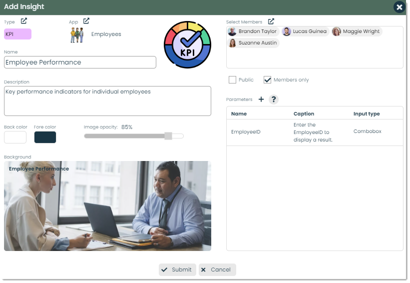
Let’s cover the different fields of this screen.
Type – You can add a primary category, defined by you or your organization, that this Insight falls under. This is a great way to organize your Insights into singular, distinct categories.

Click the link icon to select a new or existing type. Each type consists of a name, color and optional image.
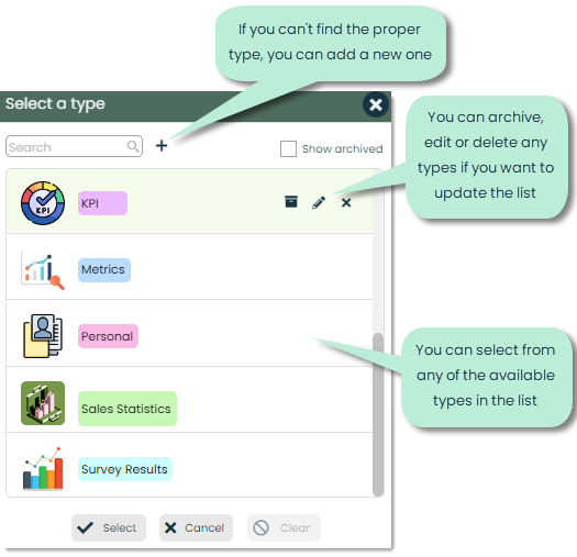
For more on Types, check out our article on Using Types.
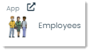
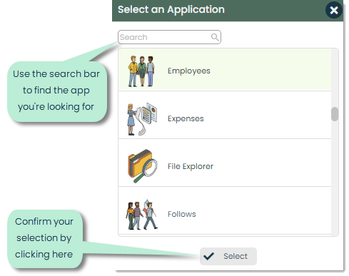
App – You can link an Insight to a specific app using this field. When you link an Insight to an app, such as the Employees app in the example below, you’ll be able to view the Insight not only in the Insights app but also within the Employees app under its Insights tab.
To select an app, click the link icon and choose it from the list.
Here’s an example of what you would see in the Employees app if you’ve linked an Insight to that app.
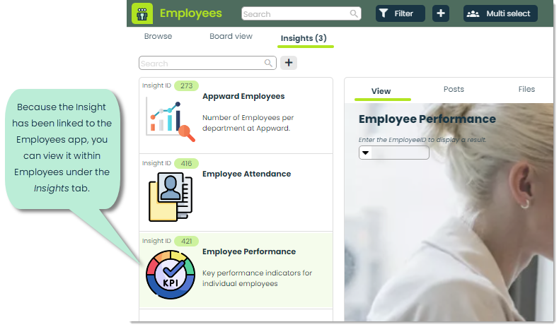
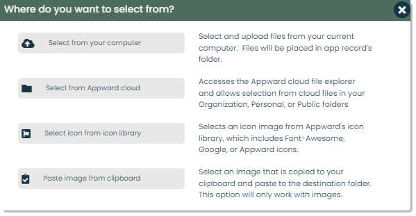
Image – You can add a visual element to the Insight record with an image. This image is what gets displayed when browsing through the lists of Insights.
Click the + Image button to select from any of the following sources.
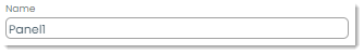
Name – Here, you can enter the title or subject of the Insight.
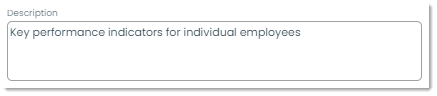
Description – You can use this section to add more context on the content of an Insight..
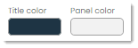
Main colors – The appearance of your Insights are highly customizable. The Back color and Fore color properties control the main background and text colors of an Insight, respectively.
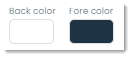
You can change these colors by clicking the squares. The following color popup will appear.
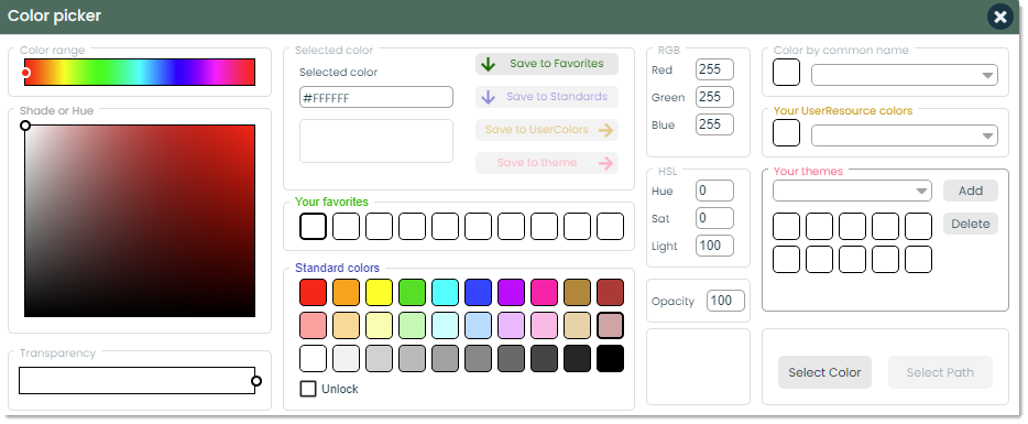
For more on selecting colors, check out our article on Using the Color Picker.
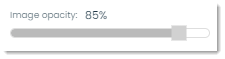
Background image and opacity – You can personalize an Insight even more by add a custom background image. Similar to the previous image selector, you can choose an image from a number of sources, then preview how the background of the Insight will look.

Image opacity controls the transparency of the background image. The higher the opacity, the less see-through the image is and vice versa.
Members – You can select a set of exclusive members for an Insight. This selected people will have editing and, if the Insight is marked as Members only, viewing privileges.
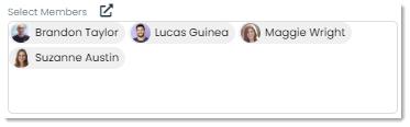
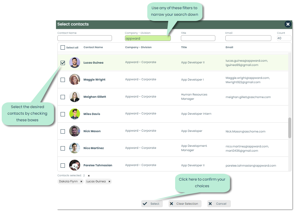
To select members, click the link icon. This will open a window for you to select individuals from your Contacts app.
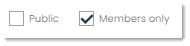
Access level – You can choose to have the Insight be publicly viewable or for members only. If you select Members only, only the people selected in the Members section will be able to view the Insight.
Note: By default, the only person that can edit an Insight is the creator. If an Insight is marked as Public but you have selected members, those members will be able to edit the Insight too.
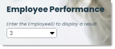
Parameters – Parameters allow viewers of an Insight to dynamically display Insight results. For instance, if you’re tracking individual employees using the same Insight template, parameters enable you to select whose information you want to view. Let’s look at the below example.
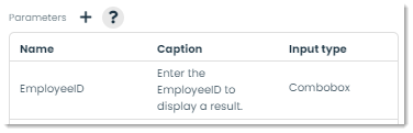
In this example, we’ve added a parameter called EmployeeID to filter our Insight results based on the employee that the viewer wants to see. We’ve provided a caption of “Enter the EmployeeID to display a result” to prompt the user. The input type of Combobox means that there will be a dropdown with different ID’s that the viewer can choose from. Here is what that parameter looks like in the Insight.
To add a new parameter, click the + button. A popup like the following will appear.
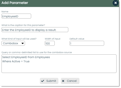
Here are the different fields you can add for a parameter.
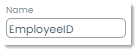
Name – This is the name of the parameter as it is used within the different Insight panels. Whatever name you give here is the name that must be used within your panel queries.
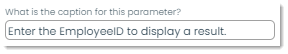
Caption – This is the prompt that the viewer of the Insight will see for that parameter. By default, an automatic caption is generated (“Enter the [parameter name] to display a result.”), but you can adjust it to whatever you’d like.
Input type – You can control what type of input you’d like from the viewer.
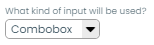
You can select from the following input types:
- Text – This is a textbox where the user types their input
- Combobox – This is a dropdown of options that the user selects from
- Date – This is a date picker that the user can pick a calendar date with
Width of input – This value controls the width, in pixels, of the input box. You can adjust this based on the expected size of the user’s input.

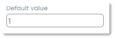
Default value – When the viewer first opens the Insight, this will be the initial input used when displaying results. If this was for EmployeeID, this means that an EmployeeID of 1 would be input and the information for Employee 1 would get displayed.
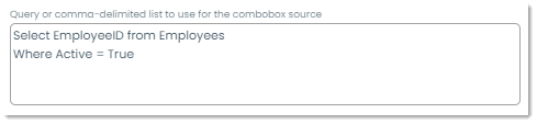
Query or comma-delimited list (for comboboxes) – If you select the ComboBox input type, this feature controls what is actually displayed as choices for that list. As you can see below, a SQL query is used to grab all employee ID’s where their active status is true. In short, the combobox will consist of all the ID’s of active employees. You can use this method, or you can make your own comma-separated list of options. For example, you could put “1,2,3,4,5” and the choices in the dropdown would be numbers 1 through 5.
Once you’ve added all the information of the parameter, click Submit at the bottom to add it. You can add as many parameters to an Insight as you’d like. That way, you can use multiple criteria to filter your results by.
After adding all the information of the Insight, click Submit to create it.
How to add panels to an Insight
Insights are built on components called panels. Each panel contains a different set of information that you want to display, and the combination of all the panels is what creates a data-rich Insight. Here is an Insight that uses several panels to display statistics on company applicants from a desired year.
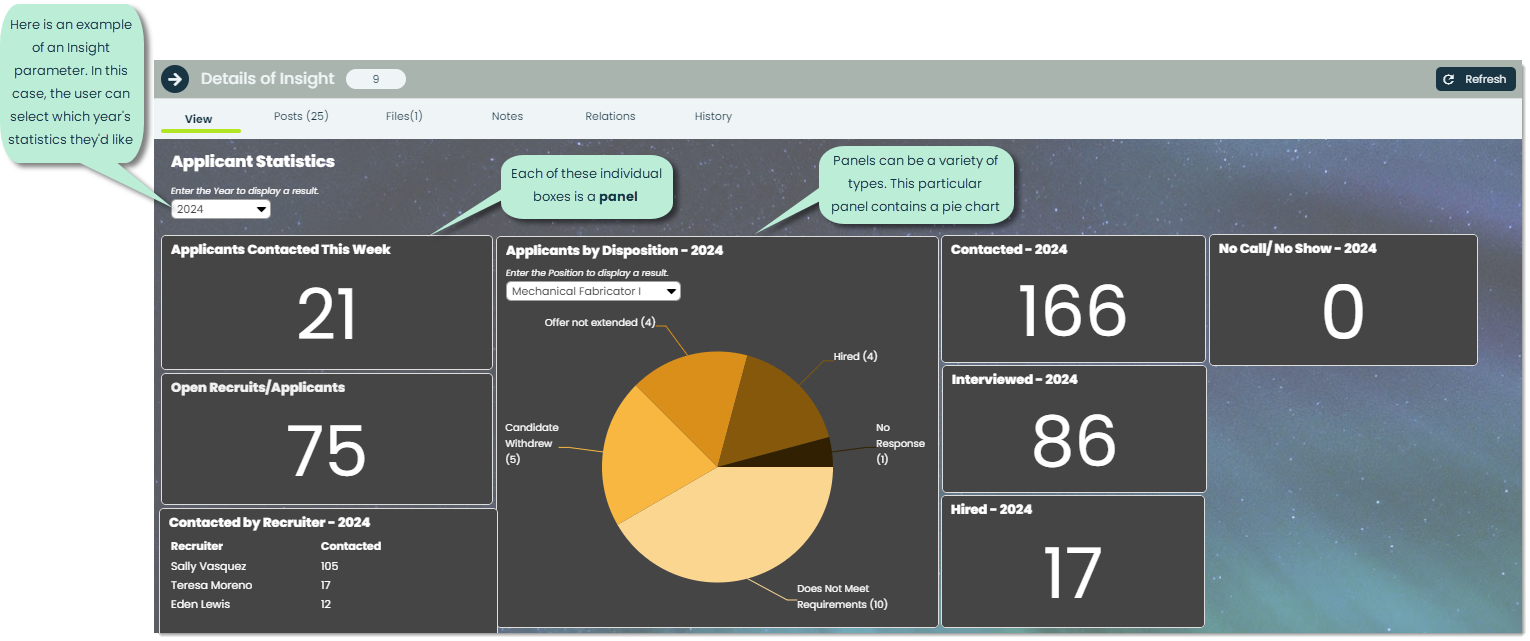
Each of the boxes in the Insight are individual panels. Each panel contains its own set of information, and the combination of all the panels forms a mosaic of data particular to a central topic.
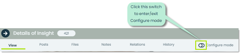
To add a new panel to an Insight, you must enter Configure mode which is essentially a setting where you can make edits. You’re able to do this for any Insight that you create or that you are a member of. You’ll see a button like the following image.
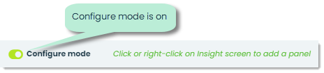
Once you’ve entered Configure mode, you can click anywhere on the Insight screen to add a new panel. You’ll get the following popup.
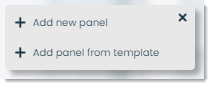
You can either add a new panel from scratch or from a template. Let’s go through each separate process.
Add panel from scratch (Add new panel)
With this feature, you are building a panel from the ground up. A blank panel like the following will appear.
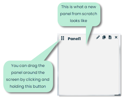
To edit the panel, click the pencil icon in the top-right corner.
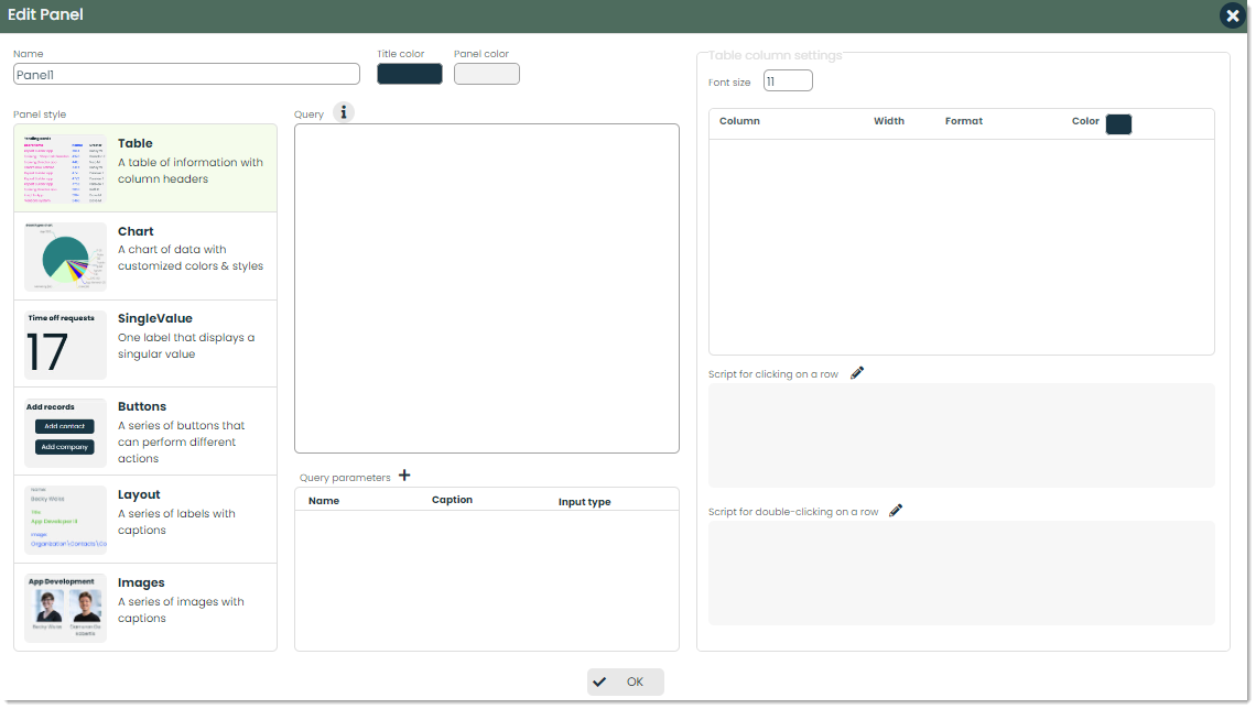
Let’s cover the different fields of this screen.
Name – This is the title of the panel. It will appear in the top-right corner of the panel when viewing the Insight.
Title/Panel color – Similar to how you can control the colors of the Insight, you can adjust the colors of the panel title and background here.
Panel style – This is where you decide what type of panel you want to display.
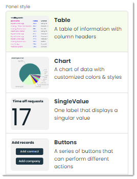
The different panel styles are:
- Table – A table of information with rows and columns
- Chart – A chart of data with customized colors and styles
- SingleValue – A single label that displays one value
- Buttons – A series of buttons that you can configure to perform specific actions
- Layout – A series of labels with captions
- Images – A series of images with captions
Depending on the style you pick, a different set of settings will appear on the right side of the screen. We’ll cover each type of panel style and a sample query for each in the next sections.
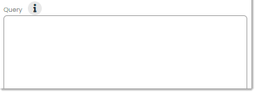
Query – Here is where you’d write a SQL query to request the exact information you want to display. If you are using any query parameters, from either the main Insight settings or from the panel, you can use curly bracket notation ({PARAMETER}) to insert it into your query.
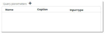
Query parameters – Similar to parameters for the overall Insight, query parameters within a given panel allow viewers of to dynamically display results for the panel.
Adding a Table panel
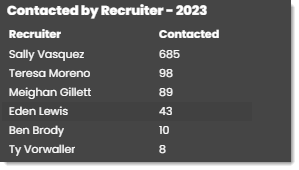
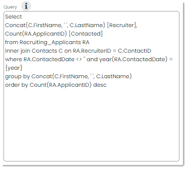
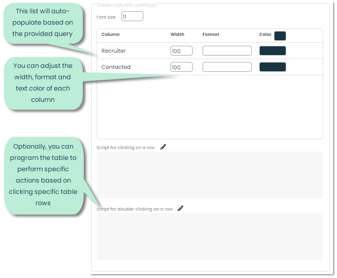
From the Edit Panel popup, click the Table style. For the query field, you will be querying for all of the columns you’d like to display in your panel. In the example above, there are two columns for “Recruiter” and Contacted”. This is what the query looks like.
After typing in a valid query, those requested fields will appear under Table column settings.
Adding a Chart panel
From the Edit Panel popup, click the Chart style. There are many different types of charts, and what you choose to display is entirely up to you. The different types of charts are as follows:
- Line
- VerticalBar
- HorizontalBar
- Funnel
- Pyramid
- Area
- Spline
- SplineArea
- StepLine
- Scatter
- Pie
- Doughnut
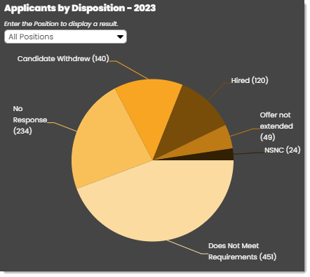
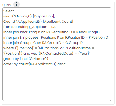
For the query field, you will be querying for the x and y axes of the chart. In the example above, there are two fields for “Disposition” and “Applicant Count”. This is what the query looks like.
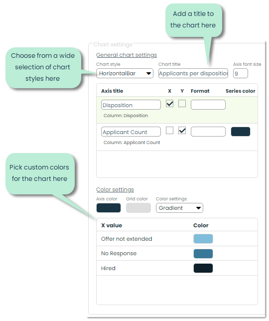
After typing in a valid query, those requested fields will appear under General chart settings.
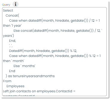
Adding a SingleValue panel
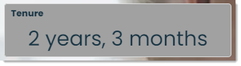
From the Edit Panel popup, click the SingleValue style. In the example above, the field that is displayed is a time duration. This is what the query looks like.
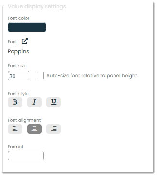
After typing in a valid query, those requested fields will appear under Value display settings.
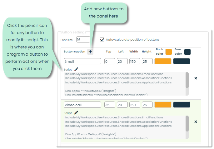
Adding a Buttons panel
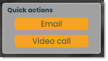
From the Edit Panel popup, click the Buttons style. This style does not require a query. You can simply add new buttons by clicking the + button as pictured below. Then, you can add scripts to the buttons using Link, Appward’s built-in scripting language.
Adding a Layout panel
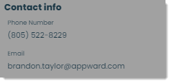
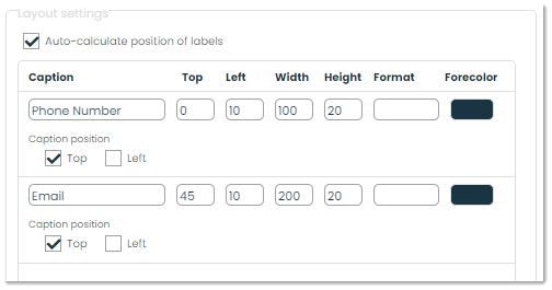
From the Edit Panel popup, click the Layout style. In the example above, a phone number and email are retrieved. Here is what the query for this panel looks like.
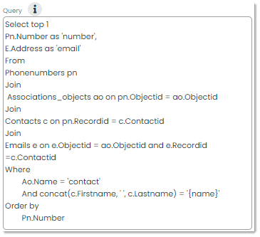
After typing in a valid query, those requested fields will appear under Layout settings. Here, you can adjust the caption associated with each value as well as the styles for each.
Adding an Images panel
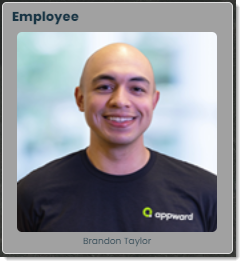
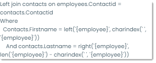
From the Edit Panel popup, click the Images style. In the example above, a contact image and caption are retrieved. Here is what the query for this panel looks like.
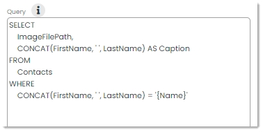
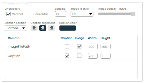
After typing in a valid query, those requested fields will appear under Image settings. Here, you can adjust the style of the image and indicate what values pertain to the image and the caption.
How to search and filter for Insights
To make finding records easier, Appward provides searching and filtering options to find what you need quickly. These features can be found at the top of the app.
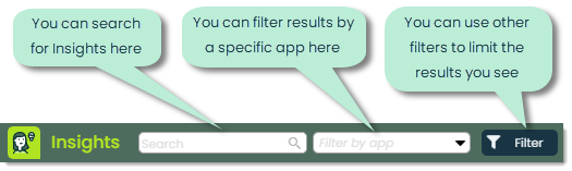
For Insights, you can search by any of the following criteria:
- Insight ID
- Name
- Creator
- Description
- Insight type
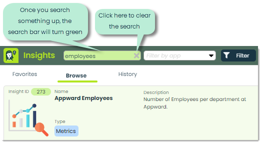
After you type something in the search bar, press Enter to search.
Additionally, you can use advanced searches, another powerful feature for finding exactly what you need. Advanced searches use a format of “Field=Value” like the following example.
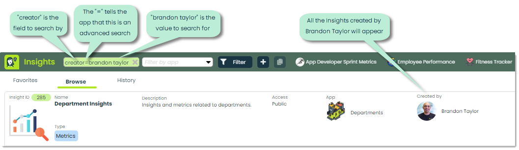
With Insights, you can use the following keywords for your advanced searches. We’ve provided some examples as well.
- InsightID or ID (insightid=356)
- Name, N or Insight (n=employee metrics)
- Description or D (d=used for management)
- Creator or C (creator=brandon taylor)
- Type or T (type=app)
Note: Searches are NOT case sensitive, so no need to worry about capital letters.
In addition to searches, you can choose from the following filters to narrow down results by clicking the Filter button.
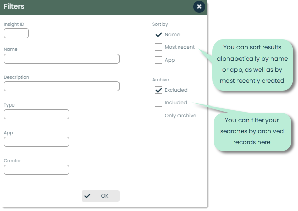
You can use a combination of searching and filters to get the exact result you’re looking for.
Frontline features of Insights

In each application, you’ll find a set of core Frontline Features neatly organized in the Details flyout. For Insights, these practical features include:
- Posts
- Files
- Notes
- Relations
- History
Posts – Posts act like an in-app bulletin board, making it easy to share updates and communicate within your team about a particular Insight right from the app. Mentioning others using the @ symbol lets you notify specific contacts or departments, and they can jump straight to the relevant record in the app from their notifications. It keeps everything connected and in context. You can also like and reply to posts, creating a space for straightforward and meaningful dialogue.
Files – In the Files tab, you can attach important documents to your Insight records. This feature allows you to add as many files as necessary and view them using the embedded document viewer. It’s a practical way to include and review relevant documents within the context of the Insight.
Notes– With the Notes tab, you can capture quick thoughts and details directly within the app, making it a handy tool for on-the-go annotations.
Relations – Relations are used to create a link between different pieces of data. Say, for example, an Insight has been created to track the performance of a department from your Departments app. If you wanted to link a department-related Insight to the department, you could accomplish that through relations. From the Relations tab, you can click the + button to form a new relation. You can indicate what kind of object the Insight is related to, identify the specific record and describe the relationship between the two records.
History – The History tab is your record-keeper for recent actions on Insights. This feature is important for tracing back any changes as far as who made the change, when they made it and what kind of change it was.
Additional features of Insights

Refresh – The Refresh button is used to refresh an Insight to show the newest edits and updates.
Favorite – If you want to add an Insight to your Favorites tab, you can click this button. This will also add the Insight to your app header like pictured below.

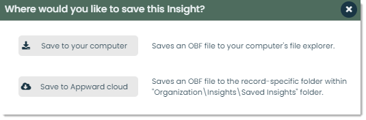
Save – You can download an OBF file of an Insight by clicking this button. You can save the file to your computer or the Appward cloud.
You can then load it in as your own by clicking the load button in the top-right corner of the app.

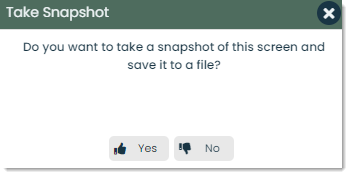
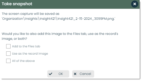
Snapshot – You can take a screenshot of an Insight with this button. You can then choose to add the screenshot as a file to the Files tab and/or use the screenshot as the record’s image (the thumbnail for that Insight).
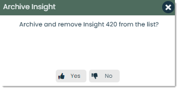
Archive – If you want to remove an Insight from the main view without fully getting rid of it, you can archive it. If you want to un-archive an Insight, you can use the Filter feature to filter by archived insights, then click Unarchive where the Archive button was.
Delete – You can delete Insights that either you have created or that you are a member of. When you try to delete an Insight, you will see a message similar to the following.
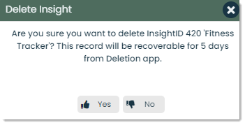
Appward uses a recovery system in the case you delete something and want to restore it. If you confirm Yes, you will have five days to recover the record from the Deletions app. This can be found under the Utilities category of the top navigation bar.
How to use Insights in other apps
Insights are not only used in the Insights app, but in other apps as well. In most Appward apps, there is an Insights tab which is used to house analytics that pertain to that specific app. This is a great way to keep your Insights grouped and organized. Let’s look at an example of this in the Boards app.
Boards
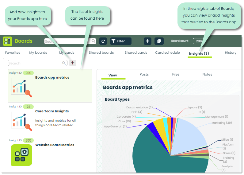
For any app that has an Insights tab, the functionality is entirely the same. You can view and create Insights as you would from the Insights app.
Published by: